Tuesday, 31 December 2013

Final Piece

This is my final CD cover, inspired by one of Lenka's old albums. I have mainly used hand drawn illustrations, some of the only digital elements used are production information, barcode and record label and also the groups of triangles used all over my picture. I like the idea of a tree on the front but when it was printed it wasn't as clear to see and the typeface on the tree branches wasn't as clear, i would either get rid of the drop shadow or change the typeface on the branches.

Monday, 30 December 2013

Case Study - Art Chantry

I have made my own copy inspired by Art Chantry. I used an pop art style to make a concert poster for The Ready Set using bright greens and pinks. 


Tuesday, 10 December 2013

Ink Drawings For Final Piece


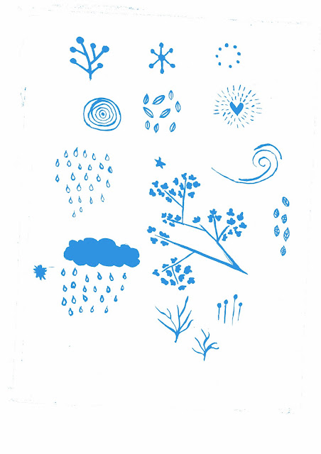
These are drawings which i have done in ink and then scanned into the computer. After i scanned them into the computer i put them on to photoshop and removed the background and then changed the threshold so they look effective on the computer. i then clicked on the layer and changed the colour of the line to use on my final CD cover.


Monday, 9 December 2013

Sunday, 8 December 2013

Experiment 3 - Ink Drawings


These are ink drawings which i have drawn and then removed the background and changed colours using photoshop.


Monday, 18 November 2013

Experiment 2 - Pen Tool Colour Doodle

I have put my drawings into illustration and then I have used the pen tool to colour in elements on my page such as writing and pictures.
This is my finished coloured in doodle design which I made using illustrator and the pen tool.

Tuesday, 5 November 2013

Experiment 1 - Illustrator/Photoshop Doodle


I scanned in my drawn doodles and then put them on illustrator to make them  a bitmap format and then I have taken them into photoshop to edit them and add effects.
I have drawn circles and placed them beneath my design in a low opacity to create a bubble effect.

Monday, 4 November 2013

Doodles (For CD Cover)

I have drawn some doodles and gone over them in fineliner so I can scan them into the computer and edit them.


Sunday, 3 November 2013

Badge Design


 These are some badge designs to go with my artist and cd cover.

Wednesday, 16 October 2013

Monday, 14 October 2013

Hand Drawn Type


These are types I have drawn and gone over in fineliner to potentially use on my cd cover.

Saturday, 12 October 2013

Contact Sheet


The ones I have chosen:
The ones I have chosen have good light and interesting subject matter. The backgrounds aren't cluttered and the main object is in focus. I am planning to use the photo of the red buds, to draw and then use later on, on my final cover. The colours on these photos are vibrant and eye catching and draw your eye to other parts of the plant/flower. For example the white flower with the yellow centre.

The ones I haven't chosen:
The ones I haven't chosen have different things wrong with them, for example the thorn is too dark so you can see the actual plant and also the background is cluttered. In some of the others the background is cluttered and some of the subject matter aren't in focus. The colours in these photos lack vibrancy and therefore make the photo less impressive.  

Friday, 11 October 2013

Moodboards


I have created two moodboards to help me with my designs.

The Vamps Cartoon Drawings


I have done cartoon drawings of The Vamps to use on my cd cover. I have gone over them in fineliner and I will scan them into the computer and then edit them to use on my final piece. I have drawn the cartoons using the photos below my drawing.

Digital Design (Collage)

I have designed two small physical copies of potential cd covers using techniques such as collage, tea staining and magazine cut outs.

Monday, 30 September 2013

Quick Pencil Drafts


I have sketched out some quick pencil designs (one in colour) for potential cd covers.

Sunday, 8 September 2013